Showing posts with label disegno. Show all posts

Thursday, January 1, 2015

Happy New Year Buon Anno


Dear Art-loving friend,

Here are some images of my freezing walk out to the Old Town in Umag, Croatia, to ring in my new year.  I wish you a year (and more!) of abundance in energy, interesting thoughts, and working towards your dream while helping others when you can.  Enjoy these images, for I must return to my disegno [Italian word meaning ‘design’ and ‘drawing.’ I like it that they do not distinguish the two concepts].


Can you see the Constellation Orion in the upper left?  Lovely.

Monday, August 20, 2012

Sir Lawrence Alma-Tadema


Cari Amici (Dear Friends),

I have returned to Firenze, Italia, from my lovely trip to Serbia, only to discover that I have too many friends. Ha.. My life seems to be go-go-go and while it is a lot of fun and I feel a bit spoiled, I am also feeling antsy because my art making has slowed too much. Soon, I go to Spain to study mural making. It was an excellent opportunity too good to pass up and the timing could not have been better: I have a commission to paint my first mural. I am excited and nervous about it since there are many new things for me to attempt.

I am currently trying to seclude myself for this week to finish the bozzetto (Italian for “sketch,” in this case similar to maquette or a small model of an intended larger work). Like most artists, I find inspiration from my colleagues of the past, as well as my contemporaries and my own imagination. Most of my work happens in my head long before anyone else will even see one mark of it. I was delighted last weekend when I visited my clients and showed them my charcoal sketch. It was very loose and I commend them and their friends for catching on to what I was trying to express.

To find inspiration for this project, I turned to one of my favorite romantic artists, Sir Lawrence Alma-Tadema [Born: Dronryp, Netherlands on 8 January 1836; Died: Wiesbaden, Germany on 25 June 1912]. He is often thought to be British (and lived in England for many years), but his interests and life were much broader than one country could hold.

I am including four images here of some of Alma-Tadema’s paintings that helped me with my composition. I also include here an image that I took in Serbia, which is also playing a role in my future mural.

Basically, I was told by the client what elements he wanted in what started out as a painting for a wall. But I had envisioned something larger and next thing you know he was preparing the wall with the latest technology in Italia: cork insulation with aluminum foil to keep out moisture and then covered in fresco-type material and sealed. You might imagine the laugh we had when I told him what I had envisioned as he sent me progress reports on the wall each day that I was in Serbia! [The foil threw me, but is laminated on a sheet of cork… whereas I had envisioned a home-made job of sheets of foil being pushed into the wall and lots of wine drinking going on to get corks available. Ha. My vision no doubt is also a memory of my friend Andrew Corke who is creating art with real wine corks. But, I digress . . . as I do.]

I made a list of all of the elements my client wanted (three curvaceous, long-haired scantily clothed female figures, Roman ruins, arched window(s), a pool for the ladies, etc.). I then mapped out the proportions of the wall and included various architectural elements (such as an awkwardly placed “window” in the wall) and furniture that would block some of the view of the mural.

My first disegno did not make me happy. It felt cluttered and lacked the impact that a mural should have (as a good street painting does). However, it was a necessary part of my process because my reaction to it led to a much better second attempt. So, I now have approval and need to solidify the drawing and hire the models. Stay tuned for progress images, although there will be a trip to Spain here before the mural begins.

Saturday, February 23, 2008

Figure Drawing - Valentina Italian Model

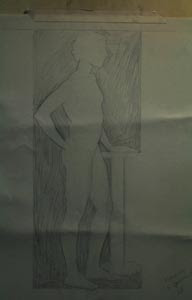
On the 18th I started a new charcoal drawing of an Italian model named Valentina. She is a lovely girl, and I think a bit exotic looking. She is in a standing pose, with her left hand on her hip, while her right extends out to her front and side and rests on a short easel. I chose the back view of her because I love the dramatic lighting contrast. That said, I have also started a pencil sketch from the other side of the room, so that I can have more fun.

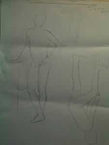
In this first collexion of images, you can see my quick gesture sketch. Here I work out my disegno in a small scale and decide how to create my image using “C” and “S” curves. Although I hope that I am getting better at sketching proportion without measuring, my goal at this stage is to make my choices before I start the actual drawing.

The middle image was taken of my 60-centimeter outline sketch of the figure. She has been given romance and architecture (curves for interest; straight lines for strength). In the image on your right, you can see that I have also outlined the shapes of the shadows.

In the second row of images, I have now colored in the shadow shapes, so that I may refine my shapes and design. I have also gone one step further by delineating the separate shape of the darkest darks in the model’s hair. In the close-up image (right), you may see what I am doing a little easier. Also, some of my mistakes are apparent, such as the upper right arm being too thin.

But, onward through the fog . . .

Saturday, February 2, 2008

Sight Size Ecorche Drawing

I began to tell you of my sight-size drawing method progetto of the male écorché. Let me also explain that since my paper is smaller than the plaster cast that I am drawing, I have moved my easel forward to align the vertical placements of the original figure with where I desire to draw my figure. You may also note that I used a level to insure that the easel and drawing board are vertical.

I begin my drawing from a distance – the same spot marked on the floor so that my viewpoint is always the same (be careful not to wear high heels one day and flats the next!). I study, look, and visually choose the position on the paper that I wish to make my mark. Then I advance and draw on the paper, immediately retreating to my same viewpoint to see if I have made the drawing accurate. This is a slow process, because I do this starting with every height and width, often using a knitting needle in my fully extended arm to measure the original and compare to my marks on the paper.


In this photo, you can see that I have drawn the outline of the figure, as well as the shapes of the shadow areas. I must decide what is in shadow and what is in light. The lightest part in shadow will always be darker than the darkest area of the lights. This drawing process helps me to never lose my form, which is determined by tone (and edges). After creating the line drawing of the figure and shadow shapes, I then make all of the background near the figure dark. Then I can see more clearly all of the errors in my shapes. For example, the straight arm is way too thick. More to follow . . .

Sunday, January 13, 2008

Drawing and Gesture Sketch


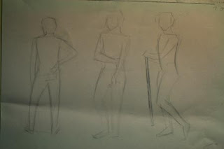
During the mornings of this past week I have spent my time creating drawing studies of an Italian model named Francesco. I will begin on Monday to create a 5-week charcoal drawing of him. It seems almost backwards to spend a couple of hours perfecting a gesture sketch, which by its nature implies speed. However, if the idea or emotion is not captured early on in an artwork, there is really no point in continuing. How one begins sets the tone for the rest of the project.

Here you can see some of my gesture sketches. I went into Photoshop to increase the contrast a bit so that you may see my light, sketchy lines better. It is meglio to draw light lines in the beginning so that one feels free to change the disegno. This is the time to make the major design decisions. Shapes, patterns, angles, variety, gesture: I must use these elements to create un disegno that conveys an idea worth viewing.


The image of the figure in the dark box shape is actually an exercise in drawing the negative spaces, the shapes around the object depicted [which is considered the positive space]. I first created a simple gesture sketch to help me place each negative shape in context with the next so that as I worked, the figure emerged. Then I draw each shape that is not the figure, shading it in order to see it better.

It is in the refinement in the drawing of the negative spaces that the articulation of the figure is created or added. My beginning sketch of the figure consisted only of “C” and “S” curves. No articulation (breaking down the specific components of a form within the gesture, as well as the addition of architecture).

Before creating the drawing you see here, I randomly drew various negative shapes from several poses, without relating them to one another. The exercise was not to draw the legs, but to draw the shape between the legs – a personality all to itself! The main observation is that all relationships give us information about our subject’s character and we must not forget to note the less obvious around us.

Click here for more Information about drawing with Romance and Architecture)

Thursday, December 6, 2007

Sara – Big Form Modeling in Charcoal Drawing


Picking up where I left off:
The sooner I convey the illusion of form, the stronger my disegno (design or drawing). Allora, after I distinguish the main tone design, I want to start turning the form with Big Form Modeling. Like other drawing systems, I will work large to small. This means that my first objective is to depict the entire figure as a three-dimensional form. Then I will do the same, within the context of the larger form, for the smaller forms, such as an arm.

I tend to like the brush, thus far, for things such as subtle blending. I get plenty of dust as I sharpen my charcoal sticks against a sandpaper-covered board (a small cutting board or a ping pong paddle work well – something flat and strong). So, I dip my brush into the dust and work my way from darks to light. How quickly I go from dark to light depends of the form I am creating.

In today’s images, I am showing you the beginning of Big Form Modeling on the figure’s head. The first image shows the head as a pattern of light paper with generalized dark shapes. The second shows that I have started to indicate that the head is an egg-like form, becoming darker closer to the bottom of the face, which is further away from the light source above the figure. I can do Big Form Modeling from side to side, as well as vertically.

Wednesday, December 5, 2007

Sara – A Charcoal Drawing Process


My last day working with the model Sara is Friday. I wish I had more time, but then six weeks seems really long to most 2-dimensional artists.

These next two images were taken on the 8th of November. Here you can see that I have done a really poor job of creating consistent tones. I will work to correct this before moving on to the next step in the system. In the beginning, I only have two tones in my disegno: the light of the paper plus my added darks. You may see in the detail shot what I mean by abstraction of nature. The shadow on the wall behind the model is grouped together with the figure-in-shadow, creating one solid dark shape. I can re-find the line separating the two later – or not. My choice. (You can also see the vertical striping pattern of the textured Roma brand paper.)

The next step is to start to differentiate the darks by averaging together the DARK DARKS (such as the hair and shadows of the legs on the box). Those DARK DARKS get compressed charcoal, so I want to be sure of where I want them in my design. I then have my shapes set in three tones, all determined by the relationships to each other as I decide them.

That last part is important. Each artist makes her own decisions. A good example of the various choices one can make is in the vertical part of the leg. My tone here is not a solid one. That is because with each new sitting, there were subtle differences in the pose, creating slightly different light patterns. That portion of the leg has quite a few areas that are debatable as to whether to group them with the lights or the darks. What you see here is a case of indecision. At some point soon, I will have made that choice.

You also see in the top left section of the front of the box that I had begun to distinguish more dark tones to show the three sides to the box. (And I have lightened the background to something between the lights and the figure-in-shadow.) The sooner I convey the illusion of form, the stronger my disegno (design or drawing).

Tuesday, December 4, 2007

Sara – A Charcoal Drawing Continued


I thought you might want to see some more of my progress with my first carboncino (charcoal) drawing of Sara. I referenced the creation of the disegno of the figure’s head on 18 Nov. and also showed you something of how I transferred my cartoon to a quality toothed paper that accepts and holds carboncino.

In these next two images, taken on 4 November 2007, I have completed the transfer of the outline of the shapes in my disegno. Now I am filling in the darks. It is important to establish what is considered a shadow vs. what is light. There is no other way to define form, really. I start with vine charcoal, the French Nitram brand in this case. Using a soft B stick, I work it into the paper fairly dark. I try for consistency. Just as when building a house, an important foundation makes for a stronger house and less work further down the road. Then I use a soft sponge to really push the carboncino into the paper and fill in the tooth-y lines as much as possible.

In the close-up image of the figure drawing of Sara, you may see the difference between the roughly drawn-in charcoal (left above the head) and the sponged area afterwards (right). This is about all that I can do without the model present since all tones are relative. My background is too dark, but until I can be on -site and compare the tones on my paper to the tones I see before me, I cannot make my choices so easily. Especially since this is a new medium for me. Stay tuned . . . same bat channel.

Wednesday, November 21, 2007

Construction of a Painting


I started one of my “Naked Gondolier” series paintings this past Sunday. I am doing it in my spare time, whatever that actually means. Anyway, I used the drawing I did of “Mario” that I showed you recently in a previous blog entry as the step-off point. I like the idea of the light in a figure emerging from darkness.

However, I also wanted to imply the gondola, as well as a bridge. I mean, what else spells out Venice (Venezia) in bella Italia? I am not looking to create details, but I do want to elicit an emotional response to the romance of this city. So, I began my disegno, starting with line and a vague idea of three tonal values. I photographed my beginning and then, in Photoshop, started playing with various lighting effects.

Not happy with any one thing, I decided to just start painting. Sometimes these things have a way of speaking for themselves, you know. Yesterday, I asked the Maestro John Angel if he could give me some pointers. I felt lost because I liked the light under the bridge, but it might not work in this particular painting. I was not sure that I wanted the reflection of the bridge to alter the shape of the dark water on the left. And the list went on. I could see why artists do works in series – it becomes possible then to choose one element for each artwork and play with it. Too many notes being played at once only makes noise, not music.

Allora, I concluded my confession to the Maestro with a, “I think that I am trying to do too much with too little.” Tilting his head slightly and with a pensive hesitation, he responded, “You took the words right out of my mouth. But also, I think you are afraid to lose too much.”

Wow. He just summed up my life.

So, I will add the darks and get back to you.
Thanks for reading.

Sunday, November 18, 2007

Sara – A Drawing In Charcoal


Today has been somewhat of a catch-up day. It has been very cold in Firenze. As such, I have begun to organize and archive some of my images. That includes my progress images of current projects, such as my carboncino drawing of a model named Sara.

Here I have posted five images of my drawing of Sara’s head at various stages. I am spending three hours per day with the model, starting on 22 October. And I am moving very slowly since I am trying to learn a lot and not just produce a drawing.

You can see that each day the head has changed. There is something that I like about each one, although (honestly) there is something that I prefer in the first disegno. The problem with her was that the head was too small for the body. Because I am pushing myself, I chose to completely erase the head and observe fresh rather than simply trying to make all of my drawn features larger.

The first four images are of my cartoon. The cartoon tends to be just regular drawing paper and is where the artist creates the design. The less expensive paper gives the artist the freedom to make mistakes and change one’s mind. Once satisfied, the cartoon image is transferred onto the quality, toothed paper that will accept the charcoal medium, as described a bit in a previous blog.

The last image is of charcoal on the Roma paper. I wanted my drawing to fill the paper, so I took my original drawing to a copy shop and had her enlarged a wee bit. Then I used tracing paper to transfer my disegno. This method allows my original to not be harmed, although in this case I did not transfer from my original drawing. Anyway, the charcoal is faint because while I am going over my lines and pushing the charcoal I have drawn on the underside of the tracing paper onto the Roma paper, I am trying not to emboss the Roma paper.

Drawing of Mario - Florence, Italy


And another life drawing here. This time the model’s name is Mario. We seem to have an abundance of models here in Firenze. Lots of new faces and forms to draw. The figure is about 42 centimeters (just over 16 inches) tall. I drew in the light shapes only with a white pencil on a dark charcoal grey Canson paper. I have done some shape exercises to train the eye in which I only draw what is light, and not shadow. I had fun with it and when working with Mario, I decided to use a much darker paper so that the lights seem to emerge from darkness, adding perhaps some mystery.

The paper for framing purposes is around 47 x 30 cm, not counting what would be under the mat and frame. The drawing is signed and dated 7 November 2007. I did a few minor touch-ups after that, but that is the date that the model session was held and most of the work was done. I may get to use this sketch as an inspiration in my “Naked Gondolier” series of paintings.

“Mario” is available for private or public collexions, so please do not be shy about inquiring! Thank you for reading.