Showing posts with label Notan. Show all posts

Thursday, September 20, 2012

Critter Watch Italy

Cari Amici (Dear Friends),

          My client wanted three buxomy babes in a pool setting with an Italian landscape and Roman ruins in the background. This evolved over time, as creative endeavors do. In late August or early September, I woke up with this idea that I did not want to create a voyeuristic situation as much as an inviting one. So, I decided to have the model try a pose that looked directly at the viewer and said, “Come on in; the water is fine.” Working in a visual language, sometimes it is difficult to communicate body language in text (e-mail). So, I shot a quick snapshot in my room while I struck the pose and sent it to the model to communicate what I wanted, time being of the essence by that point.


     I am struggling now with the acrylic paint. It seems so much more fun on landscapes, but seriously, for large areas and, thus far, skin, I am still wishing for my oils. Mostly it is the fact that acrylic dries fast (creating hard edges if I am not on top of it!) and that the color dries darker than applied. That latter makes it difficult for me to match areas that I have worked on earlier. Hmmm, practice and experience with this material could help that a bit.


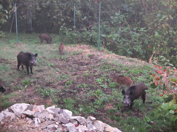
     Today’s images are my “critter pics,” consisting of cinghiale (Italian for “boar”), a sunning lizard, and the swallows are back. Like the robins in central Texas, the swallows passing through here in Italia signify a season change. I wanted summer to last longer. I never got to swim enough and I like the warmth, as well as doing less laundry.


     Oh, yeah, and one image of my “Invitation” figure that greets one as he enters the room. This image just shows Notan design. I tend to build off of that and use it to check shapes before developing the figure.

Tuesday, March 1, 2011

Notan Art Design

Cari Amici (Dear Friends),

I keep thinking about art design, specifically creating an emotional feeling with just two tones. You have heard me talk about Notan before – a Japanese design concept that uses just black and white to create a composition.

I wanted to illustrate this idea using a painting by the British landscape artist JMW Turner (23 April 1775 - 19 December 1851).

Due to a lack of time, I worked backwards and took a black and white image of Turner’s painting into Photoshop. I then greatly increased the contrast and a little bit the brightness until I had a decent pattern of mostly white and black.

Now, do not cheat and read to the end, but instead look at this image and take note of any feelings that come to mind when you look at this arrangement of black and white shapes.


As I argued in my recent newsletter, I do not see the above image as art. I see it as a concept expressed graphically, but it needs more to really communicate the idea successfully. We visual artists have a visual language and can try to make you feel something using our alphabet that consists of lines, tones, shapes/form, texture, and color. If Turner were a writer, this would be his rough draft, or perhaps the equivalent of an idea scribbled down onto a napkin at a café. More work needs to be done for the viewer to understand what the author wishes to share.

This second image is a black and white version of the painting by JMW Turner. For me, the idea has been well developed here – enough for me to understand the power in the swirling shapes.


Finally, I give you the final painting in color. The idea has been fully expressed. I hope that this image stirs something inside you. I also hope that you can see a huge difference in the basic design vs. the finished artwork. Can you guess the title?


This painting is titled “Snowstorm” and was painted in oil on canvas by JMW Turner in 1842. This beaut is approximately 92 x 122 cm. If you would like to see more of Turner’s paintings, as well as a comparison to the canvases of Mark Rothko, please click here for my newsletter on the topic of “Art vs. Science” I also wrote about the color yellow in art . . . enjoy and thank you for your continued interest in this blog.

Wednesday, January 5, 2011

T-shirt Idea Katie Notan Art

Cari Amici (Dear Friends),

Back in early December, I introduced a new artwork titled “Katie.” She is a white pastel on black paper drawing. Not truly Notan, which is a design strictly in black and white, because I have done a small amount of shading within the whites. The original artwork is shown at the end of this blog entry.

However, shortly after my original announcement, George Schreiber, one of my blog readers and a past stone carving workshop attendee, wrote to me and suggested that I put this design onto a T-shirt. This type of printing is George’s business and because of the subtle change of tones in most of my work, a T-shirt is not often the best kind of reproduction to do. “Katie” looks pretty cool, though.


He did a mockup of Katie, very rough, just to give me an idea of what it could look like.
I was thinking that this could be a fun way to add to my fundraiser for my young friend Rudy Sanchez to finally get a set of teeth. (Rudy, now 30, was born with Treacher Collins Syndrome, a facial-cranial deformity. Doctors removed the last of his teeth about four years ago and afterwards, his mother was told that Medicare considers teeth to be cosmetic and will not pay for him to get some…)

Anyway, I told George that I would think about this idea and see if there might be an interest in this design as a T-shirt. So, I am thinking of a price of $19.95 per black cotton T, short sleeves, plus $5 shipping if required. Texas-based destinations will need to pay a 6.75% sales tax, too. Any profits from this project will go towards Rudy’s teeth.

If this interests you at all, please just drop me an e-mail. If I get at least 12 people, we can make this a “go” and add to Rudy’s teeth fund.

Thank you … and thanks to readers like George who keep those ideas coming. Happy 2011.

Thursday, December 2, 2010

Flying Balalaika Brothers

Cari Amici (Dear Friends),

I never can answer the question “How long did it take you to do this?”
But I suppose I can say that technically speaking (if you do not count years of training and drawing), this next work took me two years – to the date even.

On December 1, 2008, I did some “negative shape” drawing exercises from a model named Katie in Florence, Italy. Now, once the drawing is done, you may not be able to tell that I created it by drawing only the dark shapes, relating each non-touching dark shape to the next dark shape. But this is a very powerful exercise that helps me refine my observation and recording of shapes.

As usual, I create these studies with pencil on drawing paper. In the image below, you can see that I did another drawing on the same sheet of paper, but in a different direction since the other drawing was of the entire figure and I needed the length of the paper. I do not always use my sketches to create derivative works, but sometimes I just enjoy the shapes or the lighting or the gesture and cannot get the images out of my mind. Such was the case Katie’s face.


For a couple of years now I have been experimenting with pastels on black paper. And so it seemed natural for me to transfer my pencil drawing onto black paper and fill in the Notan (white and black tones only) design with whites. Wow, what a change of effect!

This artwork is one of the new works I will debut at my last event of the year (and naturally, you are invited):

Sunday, December 12, from 2 to 6 pm.
The Curiouseum Arts Weekend inside the Community Renaissance Market
6800 Westgate Blvd. (NW corner of Westgate and Wm. Cannon)
Austin, Texas 78745
Tel.: Ruth: 512.744.3411 and Susan: 512.925.4085

Music lineup:
David Perkoff plays flute and saxophone from 2 – 4 p.m.

The Flying Balalaika Brothers play Russian folk music & a wide variety of other styles from 4 – 6 p.m.

There will also be a fashion show happening at the other end of the building from the gallery. Please pass this one to anyone you think might enjoy this kind of variety on a Sunday afternoon. Thanks!


Thursday, January 15, 2009

Notan - Designs in Dark and Light

Cari Amici (Dear Friends),

I recently found this article about Notan on the Empty Easel Web site. I had never before heard of the word, but it sounds a lot like what I am working with now in Florence, Italy.

The author Dianne Mize distinguishes between two approaches to deciding what part of an image is considered a “dark” and what is a “light” when creating an image. She calls the two styles “Design Notan” (think icon shapes of an object itself) and “Pictorial Notan,” which follows a more organic approach to light.

The artists’ choice of Notan method would, of course, greatly affect the choice of abstract shapes in one’s artwork, and therefore the emotion that the artwork would evoke. It is an interesting read, especially when viewing the images of art that she chose to help illuminate these concepts.

Pictured here is a work-in-progress image of my charcoal drawing of a model named Joshua. Certainly the finished work will look quite a bit different (I hope to share him with you soon), but it all started with a decision about abstract shapes that separate my lights from my dark patterns. And that is one reason that every artists’ work is different, even when trying to create a similar style of work.

Click here to read the original article:

Revisiting Notan: Two Ways of Achieving Harmonious Darks and Lights

by Dianne Mize