Cari Amici (Dear Friends),
When I first was offered this mural commission, I was simultaneously excited and intimidated. I knew that I could do it, but there were a lot of new things involved and I was worried about having enough time on the actual painting part of the work. In all honestly, every artwork I create intimidates me a little. I worry that I will not live up to the dream I have for my creation. However, I do not think this intimidation is strong enough to freeze my desires; I think it gives me the drive to do the very best that I can.
I put a lot of thought into the multi-figure mural composition. I had the criteria the client wanted (three babes, architecture, and Italian countryside, and a pool for the gals). And I mapped out all of the limitations, namely the large wooden “window” in the wall, the size of the Jacuzzi in the room less than one meter from the wall, a sink against the wall on the left, and the space overshadowed on the right when the picture window on the adjacent wall is open. I started to work in a collage type mode, marking my known limitations.

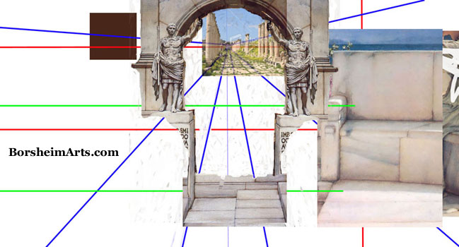
I am not very good with Photoshop, but I still find it faster to move, flip, and resize things when determining composition. My first step was to map out the dimensions of the wall, locate all of the known furniture issues, and other possibly important lines, such as the magenta lines that correspond to the height of the picture window on the adjacent wall. I had at one point wondered if any window opening I designed should match up with the lines on the other wall. Architects seem to see a certain kind of symmetry in the spaces they design.
In the next image, you may see that I added a vanishing point and drew some lines from it to key positions for figures and features. Murals (perspective drawings) are typically designed from one viewing point. Ideally, the mural should look good to a person sitting in the Jacuzzi. I consider the viewer’s position, side to side, as well as at what height his eyes will be. In this case, though, I decided that the door entering the room on the far left would probably be more of a viewer’s point, since many people may stand at the door and look in, while fewer may actually sit in the Jacuzzi. So, I later moved the vanishing point to the left of the center of the wall, keeping the horizon at my eye level (hey, I am an average height).

The wooden window was my largest obstacle. It just seemed unfortunately placed. But I loved the wood with the iron hinges and therefore did not want to just paint over it, as if it never existed. Instead I decided to feature it and create a scene in which it sort of belonged. Compositionally, I wanted the eye to move around, traveling from figure to figure and to the landscape item featured at the vanishing point. I looked into so many ideas of mathematical forms, such as spirals and triangles. And I looked to two of my favorite artists, Sir Lawrence Alma-Tadema and Sebastiano Ricci for ideas.

My first design direxion was based on the client’s idea that he envisioned an arched window looking out onto the buildings and landscape. (There were actually three arched windows in the sketch he later showed me that he had done.) I tried to design a wall with an arched window, while having that real window fit into the wall somehow. But the room has a low ceiling and measures approximately 200 x 400 cm. It was almost impossible to make my first idea look airy without the subject becoming way too small to make the impression that I was after. There was just not enough height to create a good looking arch, even though I did consider the slow wide arch of the famous “Bridge of Sighs” in Venice.

However, just as a scientist often learns: The first failures lead to the new ideas. Once we see what is not working and WHY it does not work, we approach the problem in a new way. But feeling frustrated with the space I had to work with and what I had to fit into it, I saw that my approach was leading me in the opposite direxion I wanted to go. I stewed about a day trying to figure out what exactly was bothering me and I had my “Eureka moment.” A wonderful thing indeed! I was feeling claustrophobic. Identifying my emotion led me to my answer.
I got away from the computer and took charcoal and paper in hand and started sketching. The next day, I showed the client this very rough idea, and as I said in
an earlier blog post, he is the perfect client. He saw what I was going for and jumped on board. From that point on, everything fell into place, just needing refinement as I went along.
As it turned out, none of the computer collages I did after that or even the perspective drawings contained the entire mural (I am not showing you all versions of the second idea drawings here). Each drawing helped me clarify some part of the composition in a variety of ways, having it all work in my head somehow. Incidentally, I did not worry about my “stealing” images off of the Web. I knew that my final artwork would not be an exact reference to any of the images I borrowed to create the whole of the composition. These were just aids to help me (and mostly my client and our visitors to the mural site) see where I was headed.
Thanks for reading! My book about my street painting in Italy is now available in Amazon.co.uk in the United Kingdom, as well as other European Amazons. Check it out on
Amazon.co.uk. They even allow you to see some of the inside pages!
You may also order a signed copy directly from me (no extra charge for the inscription) and I will get you a shipping quote from Italy.
Contact me directly, please.


2 comments:
I love reading about your creative process! Photoshop is a fantastic tool for artists. Thank you for posting.
Thank you, Alex. I am not that good with Photoshop, but there are times in which it sure is easier to change the scale of something, remove and add elements, and also not have your dog step on it. :-)
Post a Comment