Saturday, February 19, 2011

Ukrainian Sculptor Gregor Kruk

Cari Amici (Dear Friends),

The current exhibition at The Ukrainian Institute of Modern Art (UIMA) is of the private collection of the late Bohdan Kowalsky.. The art collections consists of paintings, sculptures, lithographs, wood cuts and drawings by Polish, Ukrainian and Ukrainian-American artists, such as Archipenko, Nowosielski, Gritchenko, Trusz, Hnizdovsky, Solovij, Milonadis, Urban and many others. His collection was bequeathed to UIMA in 2008.

Two of my favorite artworks were bronze figurative sculptures by Gregor Kruk (1911-1988). Although he had a third sculpture there, it was simply a reclining female nude and did not interest me much. However, the two sculptures I show you here were lively and emotional pieces of art and I very much appreciated their honesty and expression.


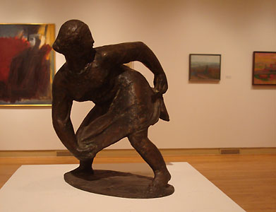
The first one is “Untitled (Female Figure with Dress)” from around the 1960s. The second “Untitled (Standing Male Figure)” from 1962. I include an image that my friend Dilbarra took of me with the sculpture of Gregor Kruk to give you a better idea of the size of these gems.


According to a page on the site of the Association of Ukrainians in Great Britain:
“After the end of the Second World War Kruk settled in Munich where he composed sculptures in bronze, clay and stone featuring (mainly) figures of peasants, kozaks, working women, bandura players and dancers. Though his works were exhibited in cities across Western Europe and the North American continent, Kruk’s main dream was to have his works displayed in Ukraine.”
There is also a photo of the artist at work at the link above.


Exhibition runs through April 10, 2011.

Here is an interesting article on the life and journey of the collector Bohdan Kowalsky.. I especially found interesting the World War II statistic that of the 11,000 soldiers in a Ukrainian division advancing towards the Russian Army, only 3,000 made it through. Get the details yourself by clicking on the link above.

Happy Birthday to my Uncle George and my cousin Jessica


Friday, February 18, 2011

Ukrainian Artists Bidniak Kholodny

Cari Amici (Dear Friends),

I have written before about the importance of viewing distances in art. Whether it is sculpture or one of those well-designed perspective drawings that you have probably seen via the Internet if not in person on the street (or other “3-d” artworks in a 2-d format), the position of the viewer can make or break the impression the art gives. But even in “normal” paintings, this distance from the artwork changes our perceptions and sometimes emotions when experiencing a work of art.

I have heard it said that gallerists can tell when a visitor is an artist vs. a collector (or perhaps wearing one hat or another because artists can be collectors too!). The collector tends to allow a single or few works grab his attention, paying little heed to the others in the room. The artist examines every single work, most often moving up close to see each stroke.

Today, I am wearing my artist cap (or should I say beret?). Here are two more landscape paintings that I saw at The Ukrainian Institute of Modern Art recently. This first “Untitled” oil on board was painted in 1963 by Ukrainian artist Mykola Bidniak (1930-2000). The detail image (particolare in Italian) appears first.


This second painting is by another Ukrainian artist, Petro Kholodny (1876-1930). His untitled landscape was painted (oil on board) in 1927. Odd that my choice here happened to be of two landscape artists whose lives perhaps never touched, the one dying in the same year that the other was born.


And finally, this last painting has little to do with this post other than I wanted to show it to you. It was also a part of the exhibit (although part of the permanent collection) at The Ukrainian Institute of Modern Art. I looked at “Traffic” up close and later from across the room. It gave me a headache wherever I stood, regardless of viewing angle or distance. However, I had to admit that this 1948 oil painting by Harold Hayden truly captures the agitation and confusion often felt when people start crowding one another. “Traffic” did impress me that I felt this uncomfortable-ness from everywhere in the room whenever I placed my eyes on it.


Thursday, February 17, 2011

Alexander Archipenko Art

Cari Amici (Dear Friends),

After I left London, I flew to Chicago to spend the weekend with my friend Dilbarra Arapova before returning to Texas. She is the wife of my friend and mentor, sculptor Vasily Fedorouk.

We had a good visit and a bit productive despite the brevity of it. Dilbarra took me with another friend to The Ukrainian Institute of Modern Art in the Ukrainian Village of Chicago.

I saw there two works by Ukrainian-born American artist Alexander Archipenko (1887-1964), one of Vasily’s favorite artists. This first is titled “La Coquette (1950),” a lithograph on paper. The second lithograph is simply titled “Two Figures, 1921.”


Here are a few shots of the museum environment. More to come next time . . .


Thursday, February 10, 2011

London Pearlies

Cari Amici (Dear Friends),

One day keeps rolling into another during my time here in London. I got antsy to do some art and had brought a small collection of pastels and a pad of black paper. So, here is a little sketch that I did of the view from the bedroom window at the back end of the flat that I am staying in.


Later one dreary afternoon, I was people-watching out the front side of the flat and caught a glimpse of a Pearly Queen. I did not know anything about this mild-mannered wildly dressed woman, but thought her quite fun to watch as she crossed the street below me. Turns out there are kings too. They wear pearl buttons all over their black clothing to attract attention to themselves as they engage in fundraising activities for various charities throughout London.


I hope you enjoy this last snapshot of a Pearly King and his charming traffic-stopping car that I took in the Greenwich Village area.

Read more about the Pearly Kings and Queens, known as Pearlies.


Wednesday, February 2, 2011

Tate Modern Art London

Cari Amici (Dear Friends),

I am visiting friends in London now and sometimes getting around a bit to visit some of the famous art sites. I thought that I could share with you that I was not terribly impressed with the Tate Modern Art Museum.

The great thing about all of the state museums in England is that they are free to enter, unless there is a special exhibit. Even then, one would only pay for that exhibit and the rest of the museum collection could be seen for free. Some of London’s treasures are so full of art that one would need a good month to see them all. The free price encourages everyone to come more often and enjoy one portion at a time, instead of getting information overload as one tries to pack it all into one day.

And while I found a few gems in the Tate Modern, I was mostly disappointed … or at least, not particularly wowed. I include a few snapshots to help you make up your own mind.


There was one, I think temporary, exhibit of an artwork by Ai Weiwei From where I stood above, it looked like an elongated room full of grey gravel. If you click on the link of the artist’s name above, you will discover that the “artwork” consists of, in fact, life-size porcelain sunflower seeds. I doubt they were even made by the artist, but I suppose I am cynical after learning about Jeff Koons back in the early 1990s when studying copyright violations. All I can say is … riveting.

However, after all of this fluff, I entered a room with a marble sculpture of Rodin’s Kiss, always a favorite! And right next to it as this lovely painting by another of my favorite artists, Edvard Munch.


This one is titled “The Sick Child” and I will quote the museum’s write-up here since I am lacking time and Internet access at the moment…

Edvard Munch 1863-1944
Born Norway, worked Norway, France, Germany

The Sick Child 1907
Det Syke Barn
Oil on canvas
________________________________

Munch made several versions of The Sick Child over a period of forty years. The image draws upon his experience of visiting a patient with his doctor father and, more deeply, with memories of the death of his older sister when they were both teenagers. The first version, painted in 1885, represented a breakthrough in his work as he responded to the high colour of Impressionism to convey a powerful sense of emotion. This version is the fourth, in which Munch used contrasting reds and greens to further heighten its intensity.”

In case you did not already know, Munch is the author of the very famous painting “The Scream.”
Till next time … thank you for reading.


Tuesday, January 25, 2011

Ghana Weaving

Cari Amici (Dear Friends),

I recently received a small package from Ghana. It was from my young friend Emmanuele Asare-Budu. He has a BFA in Sculpture and would like to establish an art school in Ghana. But he needs tools. I tried many years ago to help him come to America to study at one of the stone carving workshops here, but it is very, very difficult to help someone enter the USA, even for one week of training.

Emmanuele is very polite and dedicated to his art. He always tells me when we do communicate how much he wants to share what he knows with other artists from Ghana. I must admit that I do not know much about Ghana, but I do get the impression from Emmanuele and others that there is a growing arts community in that African country. And inside the package I received was a weaving from Ghana – in this case a green woven scarf with my name on it.

My mother has been visiting since Friday and this image is one that my redheaded sister Amber took on her camera using a timer during their recent visit. Her husband Alex is enjoying the company of girls.


These next two images we show off the new scarf. Thank you, Emmanuele. And if you would like to help this young man start a sculpture school in Ghana, please send me your contact information and I will forward it to Emmanuele. He says that what he most needs now are tools.


Finally, if you have been disappointed at all that I have not kept up my writings about places outside of America, fret not. I will be visiting London soon and no doubt sharing some of my impressions of her museums and art culture.

While I am London-bound, my brother Alex is being deployed to Afghanistan. Strange how connected, yet so very different, our lives can be... Be safe, Alex! Lots of love travels with you!

Tuesday, January 18, 2011

Tone Painting

Cari Amici (Dear Friends),

I have been working back in oils lately, fabric specifically. And my mind drifted back to one of my very first oil paintings. It was 1992. I worked as an Image Preservationist for about 60 hours per week and each Tuesday evening for two hours I attended Mission Renaissance Art School in Austin, Texas.

I started off learning to draw with charcoal on newsprint. I later moved into monochromatic oils. Then my teacher had me do a tonal exercise by painting a white cloth draped over a tin can. I was supposed to do the painting assignment in raw umber and white, but I must have been feeling a bit restless even then. I painted the cloth in blues.


It is still, oddly enough, one of my favorite paintings. Painting white fabric is a great tonal exercise and probably even more of a learning experience if you do it in a more neutral tone. You want to learn the subtleties of how light responds to form. And you want to drape the fabric in such a way that you have a variety of folds, some tight enough to create small hollows (for darker shadows) and more open … curves more than folds … so that you get to paint reflected lights that change in a more subtle manner.

The painting that I am working on now is white fabric and I am playing with warm and cool in the shadow parts. I am having a lot of fun, struggling a bit, and learning a tremendous amount. But now … onto the stripes!